The dashboard page is broken down into the following components based on what level it is being viewed, and all of the information on this page is affected by the calendar in the top right of the page.
Account level
Daily sessions: Graphic representation of the total amount of sessions per day. Sessions includes touches, lifts, and interactions with the display devices. Also shown on the graph is the average duration for that day in seconds. See section 3.3 Sessions for more information.
Brand sessions: Pie chart graph representation of how many sessions have happened within the set dates depending on display device brand. See section 3.3 Sessions for more information.
Total sessions, avg duration, merchandised, and charging: Numbers allocate for all devices connected to the account. Sessions includes touches, lifts, and interactions. Average duration is in seconds. Merchandised percentage is for all devices that are assigned to a position. Charging is the average battery status for all devices in all locations.
Uptime: Percentage of uptime and downtime for all devices within all locations connected to the account.
Compliance: Graphic representation of the average compliance rate for all devices within all locations.

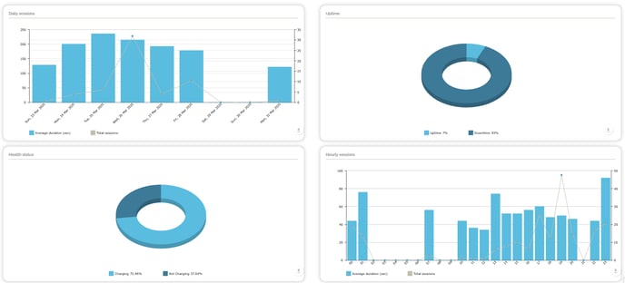
Location level
Daily sessions: Graphic representation of the total amount of sessions per day. Sessions includes touches, lifts, and interactions with the display devices. Also shown on the graph is the average duration for that day in seconds.
Uptime: Percentage of uptime and downtime for all devices within that location. When uptime is clicked the information is broken down into when the SmartCircle app was turn on or off.
Health status: Displays the percentage of when the display devices in that location were charging or not.
Hourly sessions: Graphic representation of the total amount of sessions and average duration in seconds. This information is broken down based on the hour of the day with average numbers of all days selected through the calendar.